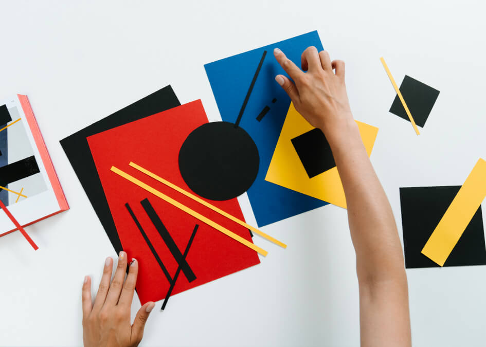
Graphic Design & Packaging
Visual communication that works. Not design for design's sake — but design that sells products, explains ideas, and makes your brand stick.
Good graphic design is invisible in the best way: people notice the message, not the medium. Bad graphic design is also invisible — nobody looks at it twice. We've spent over a decade producing everything from business cards to packaging lines, event branding to full corporate identity rollouts. The work covers digital and print, small format and large, one-off projects and ongoing retainers. What stays consistent is the attention to detail and the focus on business objectives, not just aesthetics.
Identity That Scales
A logo looks great on a white background in Illustrator. But what about on a dark product label? A tiny app icon? A 6-meter trade show banner? We design identity systems that hold up across every size, color, and context — because your brand shows up in places you haven't thought of yet.
Packaging That Sells Itself
Average shopper spends about 7 seconds looking at a product on a shelf. That's your window. We design packaging that communicates quality, differentiates from competitors, and triggers the pick-up impulse — while meeting production constraints. Materials, finishes, sustainability: all considered.
Print and Digital, Both Done Right
Brochures, catalogs, annual reports, presentation decks, social media kits, trade show displays. Each medium has its own rules and we know them. A print file with wrong bleeds wastes money. A digital asset with wrong dimensions looks amateur. Neither happens here.
Collaborators, Not Vendors
We don't disappear into a cave and return with "the big reveal." Shared mood boards, regular check-ins, honest feedback both ways. This is how work ends up reflecting the business — not just the designer's portfolio.
How We Work
Creative Brief
Nailing down the "why" and "who." What's the goal? Who sees this? What should they think afterward? Skipping this is how you end up with pretty designs that miss the point.
Concepts and Feedback
Two to three directions with full-resolution mockups — not quick sketches. Finished-looking concepts so you can evaluate properly. Then structured rounds to refine.
Pre-Production Check
Color proofs, bleed verification, resolution tests. For packaging: physical mockups you can hold. We don't rely on "it'll look fine printed." We verify.
Organized Delivery
Labeled files in every format: CMYK for print, RGB for screen, vector for scaling, raster for web. Plus a short guide so anyone on your team uses them correctly.
What You Get
Identity systems that look sharp from app icon to billboard
Packaging that impacts sales, not just portfolio aesthetics
Press-ready files — no surprises at the printer
Multi-format delivery: print, digital, social, presentation
Eco-friendly packaging options if sustainability matters to you
Structured revision process with clear timelines
Design systems that grow with your product line
One team for print, digital, and environmental — no coordination headaches
The difference between amateur and professional design isn't Photoshop skills. It's understanding context, audience, and business goals — then executing with precision. That's what we bring to every project, every time.
Got a project in mind?
Drop us a line. First chat is on the house — no commitments, no sales pitch.